Famous brand logos with hidden meanings and secret truths you didn’t know
With advertising and marketing growing day by day, we tend to see the brand logos more than we see our faces in the mirror. But do we know the hidden message that every logo shares. “Every logo tells a story, can you?”
Here are some of the world famous logos with their hidden message, secret truth and exciting origin behind it.
Adidas- Conquering the mountain
Adidas’ famous three-stripes logo which was created in 1976, didn’t carry much meaning as the brand wanted something simple yet looking good on shoes.
In the 90s the logo was tweaked a little and the three stripes were turned diagonally, which created a mountain on the other side. The change in design was to represent the struggle that athletes must go through to achieve greatness.
Amazon- everything from A to Z
Most of the people when the amazon logo for the first time, sees a smiling face. They project that arrow as a smile – giving a positive connotation to the brand but that smile does more than that.
Amazon’s arrow reached from start of the word “a” to middle of the word “z”, which indicates that sells “everything from A to Z”.

BMW-the accidental propeller
A company which was once known for not only its automobiles but also for manufacturing aircraft engines. This led to many people believe that its logo got white to signify plane’s white propeller and blue to signify sky.
But this wasn’t the idea behind the logo. Initially BMW wanted to use the colors of Bavarian Free State but it was illegal to do so, so they reversed the colors and created the accidental propeller.
![]()
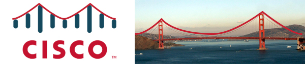
Cisco- never forget your roots
It makes total sense for a company dealing in telecommunication equipment to use lines similar to electromagnet waves. But it is not all, the shape of electromagnetic waves is in the shape of Golden Gate Bridge.
Why? Because that’s where Cisco was founded in 1984, in San Francisco. The name “Cisco” also comes from “San Francisco”.
FedEx- the hidden arrow
You look at it and you see nothing but the company’s name written in different colors but look closely and you see a hidden arrow. Between the letters ‘E’ and ‘X’, you can see an arrow, which cannot be unseen once seen. The arrow shows that the company is always moving forward.
![]()
Gerber- the Gerber baby
The Gerber Baby company began as the Fremont Canning Company and when owner Daniel Frank Gerber to sell strained vegetable and fruit as canned baby food, he put out a call for submissions to find the Gerber baby. The winner of the search was a lady, Dorothy Hope Smith, who sent it her neighbor’s baby, Ann Turner Cook. The sketch was unfinished at the time and Smith offered to finish but it was used as it is. Since the Gerber baby got so popular, the company decided to change its name to Gerber.
Dominos- game of numbers
As it names suggest, Dominos’ logo is based on a domino playing piece but what you might not know is the dots. The three dots represent the Dominos Restaurant and the first two franchisees that were opened after.
The plan was to keeping adding a dot every time a new franchisee opened but it was abandoned after the first two franchisees. Given that today the brand got probably over 10,000 stores, that was a smart move.
![]()
Google-the green touch
Google’s logo may seem normal on the surface and why not? After all its nothing but the company’s name written in colorful fonts, but then the colors don’t add up. Google has used three primary colors – red, blue, and yellow – and then there’s green standing in between. It is to show that Google is a unique company which doesn’t perform as expected.
The color mix signifies that Google’s an innovator and that it is to stand out. The same color combination is used for Google’s other products, such as Google Chrome.

McDonalds-the golden arches
Most of us assume that McDonald’s’ ‘M’ is just a ‘M’ for like – M for McDonald’s. But originally it’s not ‘M’ at all. It was the design of the building for the restaurant chain. The arches connected to an overhang kept the rain away from the customer while they were ordering outside.
The company discovered that those golden arches are quite visible to the people from the freeway, so they decided to add them to their logo. Today, it is one of the most recognizable award in the world.

IBM- love for equality
The logo we know is three capital alphabets in of the company’s name – IBM – in block bold letters with whitespaces running in between horizontally, breaking up the logo. The reason behind this is that during those days, it was difficult to print big bold letter. Original logo had thirteen lines running through it which was then reduced to eight as company’s print media caused ink bleeding issues.
Another reason to reduce the number of lines is for the equal sign, formed at bottom of ‘M’. it represents the value of equality.
![]()
NBC-the colorful peacock
The company was launched in 1956 when the color TVs were a new thing and to celebrate the same the company adopted colorful peacock’s logo which can be visible only in color TV. It was to promote more and more sale of the TVs or at least we thought so.
On their 60th anniversary in 1986, the company that the peacock’s six different colored feather was represent company’s six division in business. Also the peacock was turned so that it seems like he is looking forward.
![]()
NIKE- the $35 swoosh
There is a great and important lesson for the designers. The guy who designed the swoosh, Carolyn Davis, was actually a student at that time and she was paid only $35 for her contribution.
Later, when the company grew, Davis was compensated with a diamond ring designed like a swoosh and 500 shares of the company. This may have a happy ending but carries an important lesson for the young creators.
The logo was created in response to the simplicity of Adidas’. The swoosh-shaped design was to convey a sense of motion.
![]()
Pepsi- the patriotism
Pepsi’s logo, officially known as the Pepsi globe, was introduced during World War I. Therefore, they chose the colors, patriotic red, white, and blue, to show their support to the soldiers. They printed the globe only on the cap and the bottle had the scripted logo.
The Pepsi globe got popular and had a successful appeal to the consumer so the company decided to continue with it and since then the globe has evolved but they didn’t change the colors.

Paramount Pictures- the movie stars
The original logo had the mountains covered by 24 stars – each star for an actor or actress has signed with the studio. Yep, the stars represented the literal movie stars. Today, the logo has 22 stars but the movie stars, the studio signed is obviously much more than that.
Legend has it that the logo was sketched on a napkin and the peak in the logo is Ben Lomond Mountain.
![]()
Pinterest – the hidden pin
For a social media site which allows its user to “pin” the things they feel interested in, the name and logo is almost perfect. The name is portmanteau of the words “pin” and “interest”. To make it closer to perfect and also because of the importance the word “pin” has, they added a hidden pin design in the letter “P”.

Toblerone- the hidden bear
The Swiss chocolate is known for its unique triangle shaped chocolate bars and their logo, the picture of Matterhorn, represents the product’s country of origin. It seems like just a happy coincidence that the shape of the products resembles to the shape of Matterhorn.
But there’s more to it. If you look with a keen eye, you will notice that at the white space at the mountain top is a bear. Why Bear? Because Toblerone is made in Berne, Switzerland and bear is the symbol for Berne. Not only that but the word Toblerone is also hiding all the letter to spell Berne.
![]()

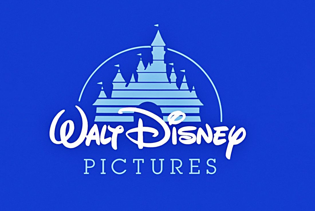
Walt Disney- the autograph
We all know that the logo we all love so much intentionally selected the fonts which not makes it difficult to read but it’s also hard to write with your hand. Many believed the that logo was made of Walt Disney’s signature but actually it is designed by a woman in his company. This did pose a problem for Uncle Walt, as when he gave autographs to his fans, they actually believed that the autographs would be like Disney’s logo but it was nothing like that.
FYI, the castle is nothing but typical Cinderella’s castle, which represent both Disney’s films and their theme parks.